New events for the New Year
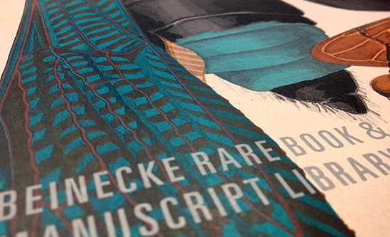
Rebecca Martz designed the Winter–Spring 2014 events broadside for Beinecke Rare Book and Manuscript Library—now in the mail. This is the third calendar she has produced for the library—the first two announced programming that celebrated its 50th anniversary in 2013.
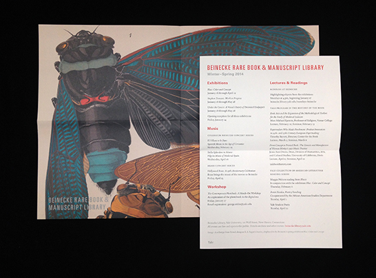
After a year that saw many publications using this celebratory branding, the Beinecke now has a widely recognized “look.”
The question arises: how should it continue to capitalize on its improved level of recognizability now that the year of celebration has passed?
In the Winter–Spring calendar, Rebecca has created a transitional object that retains some of the major branding elements that were developed for the celebration, but drops the 50th anniversary logo, replacing it with the standard Yale logo.
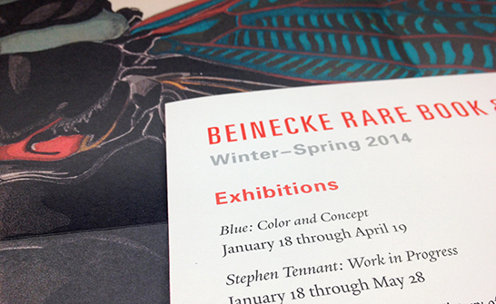
Titles and headings continue to be set in Univers typefaces, using the red and silver inks of the 50th brand. The page itself retains the same format and grid structure as its predecessors.
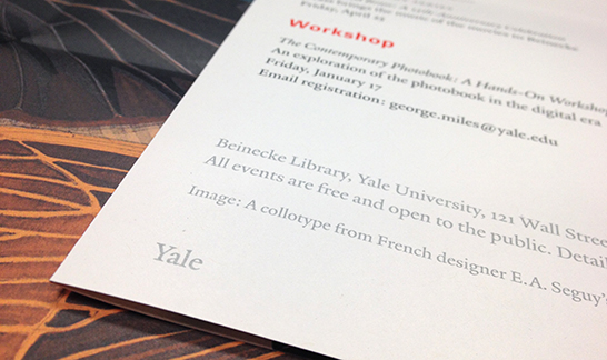
This time around, these unique Beinecke branding elements are brought into the Yale visual family simply by replacing the 50th logo with the Yale logo, demonstrating the flexibility and effectiveness of the University’s branding guidelines.
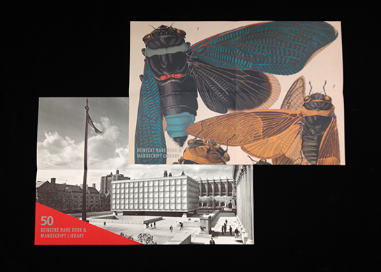
And the poster image on the reverse side of the calendar—which during the anniversary year had featured photographs of the building—now features material from an upcoming exhibition, Blue: Color and Concept.
- Log in to post comments.

