Spotted: Yale Sustainable Food Project Posters
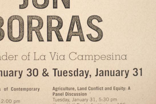
Look at that typography! That's a detail shot from a Yale Sustainable Food Project poster I saw as I walked around campus this morning. I love the choice of a rustic typeface set large for the title -- it visually reflects YSFP's mission to "engage with the world" and "draw...connections among people, land, and food."
Notice how there's a clear visual hierarchy for the titling material: The name of the guest speaker stands out first, since it's the largest and boldest type on the page. Next, the date of the event comes forward, set in the same typeface as the speaker name, but in upper- and lowercase. Finally, the subsidiary text appears, set here in a playful and lightweight serif face. (And of course, there's more information set in small type on the bottom half of the page.)
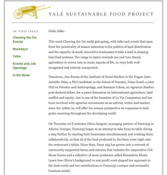
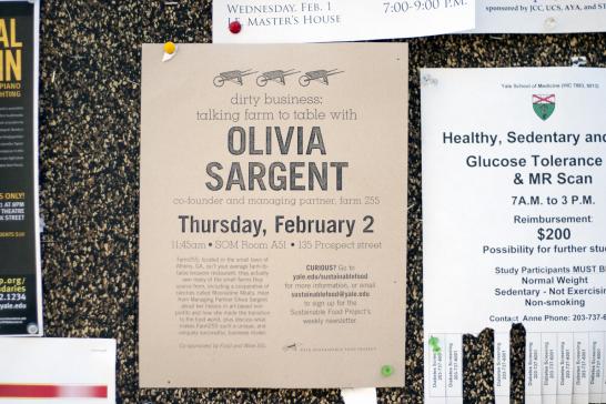
YSFP's branding is both consistent and clean, which is a major reason why it remains such a recognizable entity both on- and off-campus. Note how the wheelbarrow logo is present on all YSFP material, from email newsletters to event posters to the branded wooden blocks that hold YSFP's informational table tents in the dining halls. The use of visual hierachy also seems to be a YSFP style hallmark -- in the email newsletter above, you can see how the sections of the newsletter are set apart in green in the left margin. This lets the viewer navigate the newsletter's content more efficiently. There's a clear separation of elements (heading, navigation/sections, content in the email; title, subtitle, body text on the posters) throughout.
Learn more about the Yale Sustainable Food Project on their website.
- Log in to post comments.