New installments of the Occasional Papers!

Occasional Papers splash

Over the past seven months, our office worked with Yale Law School and Yale Printing & Publishing Services  (YPPS) on three installments of the Law School Occasional Papers. Each of these small booklets publishes one or two Dallah Albaraka Lectures on Islamic Law and Civilization given in fall 2013, and YLS sends them as gifts to alumni/ae.

Series of Three

Our office designed the first booklet as a model for YPPS to follow when typesetting the others. The design is very traditional, both in its use of Yale branding and its classical typography. 

Model booklet

Two brand elements mark these booklets as Yale publications. All type is set in the Yale Typeface, and the Yale logo or YLS wordmark appears on the last page or back cover of each. According to our guidelines, the Yale logo is the only branding element that must appear on all University communications. Here, it is set small and near the end of the little book.

Renaissance grid diagram

Page layouts derive from a “Renaissance grid,” and they are bilaterally symmetrical across the gutter. The fore edge and tail margins are considerably more generous than those of the gutter and head.

Inside spread and typeface

The folios, or pages numbers, which are located at the bottom center of the text block, appear within brackets. This convention is based on the mechanics of letterpress printing, where an isolated metal-type page number tended both to print too heavily and to wear out quickly. Placing brackets or ornaments on either side of folios helped to minimize this effect by providing greater surface areas to bear the force of the impression. We used this old convention honorifically, as we so often do when setting academic publications.

Posters for Yale

Woolsey posters installation

Two weeks ago, with the help of the School of Music ticket office, I installed three Reunion Weekend posters in the Woolsey Hall display cases. The trio replaced three posters that I designed for Commencement.

Commencement Posters

This year, John suggested that we look to Yale heraldry, and heraldic patterns in general, for inspiration. The resulting series of posters for Commencement and Reunion featured classic heraldic patterns with Yale colors and imagery.

Reunion Weekend Posters

A final set of three posters for Staff Appreciation Day on June 9 followed.

Staff Appreciation Day Posters

Congratulations to the 2014 Lohmann Prize winners!

Rose engraving certificates

Last Friday afternoon, Richard Rose, Raleigh Dadamo, Basie Gitlin, and Elizabeth Stauderman joined our office in the Art of the Book Room to judge this year’s Lohmann Prizes. Lian Fumerton-Liu ’15 received first prize for her book “Vertigo,” and Jacqi Lee received second prize for the design of the Fall 2013 Yale Literary Magazine. Juan Pablo Ponce de Leon ’16 and Cindy Hwang ’15 both received honorable mentions: Juan for his letterpress work and Cindy for her WYBC posters.

Vertigo spread

“Vertigo” stood alone in its attention to material detail and quality of craft. The book, which interprets an essay Lian wrote about Alfred Hitchcook’s movie of the same name, weaves prose, film stills, and production information to create an engrossing and unique reading experience.

Fall 2013 Yale Lit spread

WYBY poster

This year’s submissions represented a wide variety of design work on campus, from student publications and publicity, to academic work and personal projects. Thank you to everyone who participated. We hope to see your work again next year.

For those interested in viewing this or any previous year’s winning work, all are kept in the permanent collection of the Arts of the Book Collection in the Haas Family Arts Library and are available upon request.

Representing a century of the Yale Bowl

Vintage Yale Bowl Photo

This week, the Athletics Department will unveil the logo for its centennial celebration of the Yale Bowl. When Athletics brought this project to our office, they requested that the logo capture the essence of the stadium in a nostalgic, but not old-fashioned, way.

Yale Bowl research

John and I conducted considerable image and architectural research. We examined the Bowl’s original blueprints in the Facilities office. We combed through Yale’s archives of sports ephemera for color and style inspiration.

Yale Bowl Initial Sketch

The basic structure and iconography of the emblem fell into place quickly. We knew that we wanted to feature the portals—the way the view expands as you pass through the dark tunnels, revealing the gridiron and the seating in full light—an experience almost unique to the Yale Bowl and so memorable to fans.

YB100 Sketch 01

YB100 Sketch 02

YB100 Sketch 03

The graphic style was trickier to figure out. Initially, we tried to create a very strong vintage feel, heavily influenced by early 20th-century commercial illustration, featuring rich, complex colors and close values. But this style would have been challenging to apply to the range of sizes in which and materials on which the logo will appear.

Final YB100 Logo

Making many, many variations of the logo, we pared down the drawing style and color palette to what you see here—simpler to use and more contemporary in appearance.

Character-Building Content

LWL Invitation Image

Rebecca and I couldn't help but laugh at the wonderful image she is using in a new invitation design for the Lewis Walpole Library, which made me realize that in LWL’s communications, she uses recurring image treatment to build an individual look for the library.

LWL Illustrations samples

Located in Farmington, Connecticut, the LWL is the farthest outpost of the Yale University Library system. The library is a research center for 18th-century studies, focusing on British prints, drawings, manuscripts, rare books, paintings, and decorative arts.

2 LWL Catalogues

The illustrations—all selected from the LWL’s collections—are often playful, humorous, and always memorable. They are presented in silhouette against a solid-color background. Though this image treatment is simple, it creates a noticeable pattern across LWL communications.

LWL portfolio

The resulting portfolio is visually cohesive, unique, and appropriate to this library.

LWL Yale branding

Notice that all of the material incorporates the Yale logo and frequently uses the Yale typeface as well. In so doing, the LWL has developed an individual character within the University’s branding guidelines.

Announcing the 2014 Lohmann Prizes

Lohmann Prizes, early announcement

For more information, please visit yale.edu/printer/lohmann.

Family Resemblance

bulldogface

Our office occasionally takes on projects to brand major Yale events—like the 50th anniversary of Beinecke Library and President Salovey’s inauguration last fall. Yale’s identity guidelines encourage the development of distinctive logos for such singular and finite events. On the other hand, Yale’s many organizations are asked not to create custom logos in the course of their regular activities. The “no custom logos” constraint can be disconcerting to some, but I would argue that this concern is based on a common misunderstanding about how visual identity is created. A logo (alone) does not a visual identity make.

If we want our publications and communications to be appealing and recognizable to our audiences, there’s much that we can and should bring to bear in the design process beyond consistent use of the Yale logo—all within the University’s identity guidelines.

This week I designed a nametag format and welcome poster for the Long-Service Recognition Celebration, which honors staff members who have served the University for 25, 30, 35, 40, 45, and 50 years.

It got me thinking about how I could build a distinctive look—a distinct identity—from a piece of communications as small as a nametag.

Here is the old nametag design:
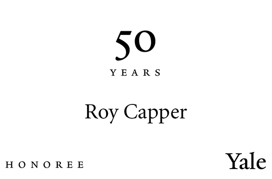
OldNametag

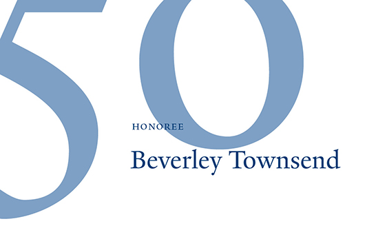
This is the new design:

NewNametag

The nametag design is based on three guiding formal strategies. 1. The use of large service-year numbers as secondary elements. 2. Left-aligned text blocks, positioned to the right of center. 3. Use of the Yale typeface and the colors Yale Blue and Pantone 645.

When the celebration organizers subsequently requested a design for a poster, I was able to build on the principles that guided the design of the little nametag.
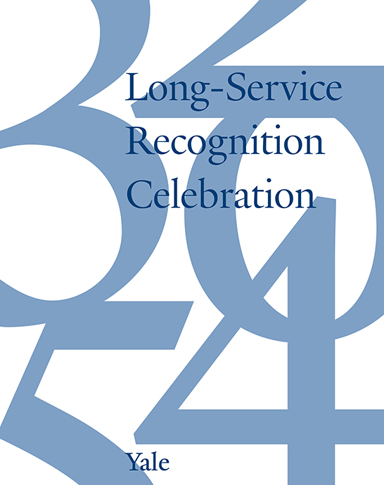
WelcomePoster

An “identity” begins to emerge. For the sake of this post, I have sketched how this new “identity” could be applied to a wide range of items:
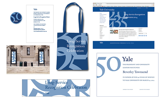
Family Resemblance examples

These designs adhere to the Yale identity guidelines, and they all incorporate the Yale logo. However, the specific choice and arrangement of visual elements creates a cohesive “look and feel,” a visual identity for this project.

What’s more, because these designs follow the Yale identity guidelines, they have a “family resemblance” to all other Yale pieces that do so. You know these pieces are from Yale, but you also sense that there’s something special about their message.

Good as new—sletter

New Beinecke Newsletter example

Hi everyone! Forgive our long absence—we’ve been very busy. I plan to share some of the office’s projects in the next few posts.

Old Beinecke Newsletter

Recently, the Beinecke Library expressed a need for greater formatting flexibility in its e-newsletters in order to publish an increasingly wide range of content.

new Beinecke format example

In the course of addressing this request, Rebecca and I also brought the style of the newsletter in line with the typographic identity that had been established for the Beinecke’s 50th anniversary celebration, elements of which have been retained as the basis of its institutional identity.

New format title close up

The new Beinecke e-newsletter is branded by the typography in the title bar and by a unique color palette—featuring Beinecke’s “proprietary” Univers Ultra Condensed headings and the accent color Pantone Red 032. These are the primary design components that would be customized in e-newsletters adapted for use by other Yale organizations.

beinecke website

beinecke 50th look

The strongly gridded style of the Beinecke’s Web site inspired us to design the e-newsletter template around a grid of square units, reserving substantial quantities of white space. Some of Yale’s most appealing e-newsletters—the Yale University Art Gallery for instance—employ a similarly gridded style.

Hierarchy content variety mockup

The “kit of parts” we developed permits greater control over content hierarchy and gives users more flexibility in matching various content types—short and longer-form stories, images, etc.—to suitable visual formats. We sought to make these functional and aesthetic changes in such a way that other branches of the Yale University Library system and other organizations around campus would be able to implement these upgrades.

The Adrian Van Sinderen Book Collecting Prizes for 2014

Esperanto Images

Winners of the 2014 Adrian Van Sinderen Book Collecting Prizes have been announced.

This year’s senior prize was awarded to Austin Jung of Saybrook College for his collection on the Esperanto language. Solene Goycochea of Morse College was awarded a senior second prize for her Basque history collection. Sarah Maslin of Trumbull College received a senior honorable mention for her collection titled “Revolutionary and Counterrevolutionary Violence in Latin America.”

For his collection on modernism in literature, Andrew Koenig of Jonathan Edwards College won the sophomore prize. Sophomore honorable mentions were awarded to Katharine Spooner (Timothy Dwight College) for her collection on the metropolitan history of London with a focus on the London Underground and to Cristóbal Trujillo (Saybrook College) for his foreign literature and philosophy collection.

For more than half a century, student bibliophiles have been receiving prizes for the quality of their book collections, thanks to the generosity of Yale alumnus Adrian Van Sinderen (Class of 1910). In 1957 Mr. Van Sinderen established two prizes, for Yale seniors and sophomores, in order to encourage undergraduates to collect books, build up libraries of their own, and read for pleasure and learning. Current first prize amounts are $1,000 for the senior winner and $750 for the sophomore winner. In 2002 an annual poster competition was added, awarding a $500 prize to the winning designer of the poster used to announce the book collecting competition.

Judges for this year’s competition were William Reese ’77 (Chair), Joseph Agostini ’93, Alec Baum ’14, Elisabeth Fairman, Rebecca Martz, Stephen Parks ’61, E.C. Schroeder, and Sylvia Van Sinderen.

New events for the New Year

poster closeup

Rebecca Martz designed the Winter–Spring 2014 events broadside for Beinecke Rare Book and Manuscript Library—now in the mail. This is the third calendar she has produced for the library—the first two announced programming that celebrated its 50th anniversary in 2013. 

both sides

After a year that saw many publications using this celebratory branding, the Beinecke now has a widely recognized “look.”

The question arises: how should it continue to capitalize on its improved level of recognizability now that the year of celebration has passed?

In the Winter–Spring calendar, Rebecca has created a transitional object that retains some of the major branding elements that were developed for the celebration, but drops the 50th anniversary logo, replacing it with the standard Yale logo.

type closeup

Titles and headings continue to be set in Univers typefaces, using the red and silver inks of the 50th brand. The page itself retains the same format and grid structure as its predecessors.

branding closeup

This time around, these unique Beinecke branding elements are brought into the Yale visual family simply by replacing the 50th logo with the Yale logo, demonstrating the flexibility and effectiveness of the University’s branding guidelines

2 posters

And the poster image on the reverse side of the calendar—which during the anniversary year had featured photographs of the building—now features material from an upcoming exhibition, Blue: Color and Concept