New installments of the Occasional Papers!
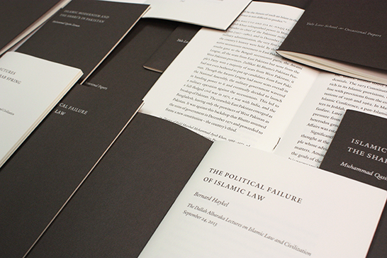
Over the past seven months, our office worked with Yale Law School and Yale Printing & Publishing Services (YPPS) on three installments of the Law School Occasional Papers. Each of these small booklets publishes one or two Dallah Albaraka Lectures on Islamic Law and Civilization given in fall 2013, and YLS sends them as gifts to alumni/ae.
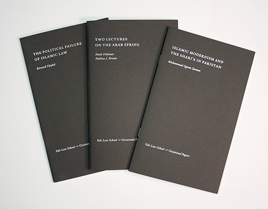
Our office designed the first booklet as a model for YPPS to follow when typesetting the others. The design is very traditional, both in its use of Yale branding and its classical typography.
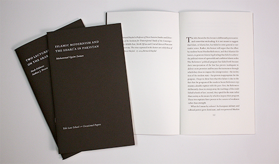
Two brand elements mark these booklets as Yale publications. All type is set in the Yale Typeface, and the Yale logo or YLS wordmark appears on the last page or back cover of each. According to our guidelines, the Yale logo is the only branding element that must appear on all University communications. Here, it is set small and near the end of the little book.
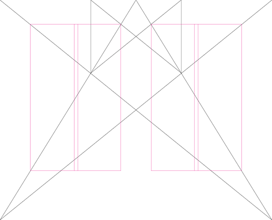
Page layouts derive from a “Renaissance grid,” and they are bilaterally symmetrical across the gutter. The fore edge and tail margins are considerably more generous than those of the gutter and head.
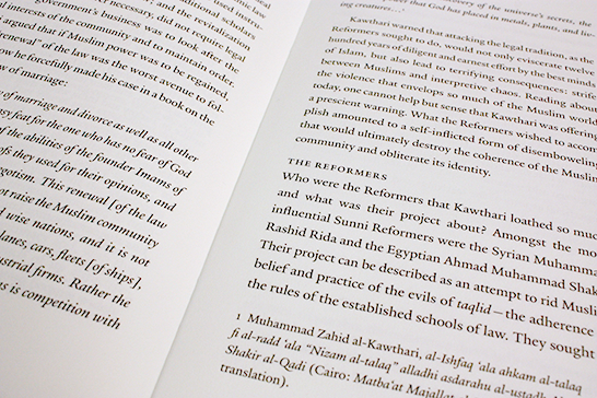
The folios, or pages numbers, which are located at the bottom center of the text block, appear within brackets. This convention is based on the mechanics of letterpress printing, where an isolated metal-type page number tended both to print too heavily and to wear out quickly. Placing brackets or ornaments on either side of folios helped to minimize this effect by providing greater surface areas to bear the force of the impression. We used this old convention honorifically, as we so often do when setting academic publications.
- Log in to post comments.

