February YSO Poster
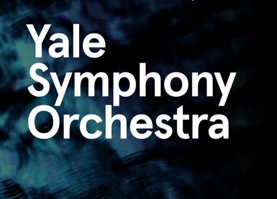
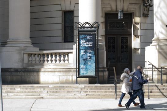
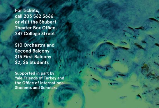
The February YSO poster is so allusive. The gorgeous swirling blues and blacks of the background texture create a visual counterpoint to the smooth white columns of Woolsey Hall.
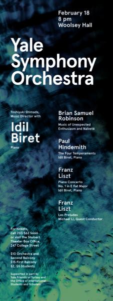
The seductive texture writhes with ambiguous mystery: are we looking at a puddle? an oilslick? a lunar landscape? The abstract imagery lets the viewer interact with the piece on an individual level. There is no single correct interpretation. Much like the music the poster is meant to advertise, the design is evocative, viscerally appealing, and deeply personal.
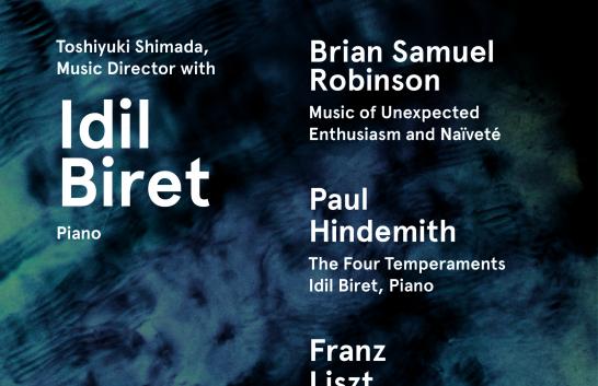
The high contrast of the type sizes expresses a clear visual hierarchy. The most important text elements (names and other essential information) come forward in the visual field due to their greater prominence, while the subsidiary information becomes apparent upon closer investigation. The size distinctions create visual interest and help organize information.
It's great to see the YSO continue its tradition of excellent design.
- Log in to post comments.