Grove Street Water Meter
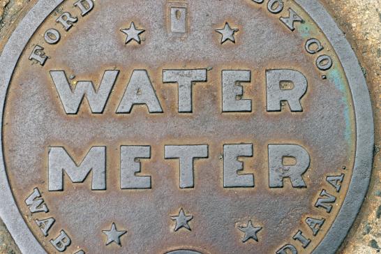
I saw this water meter cover as I walked to work today on Grove Street between Whitney and Orange. I can't recall having ever seen another sans serif like the "water meter" letters -- the "R" is particularly odd, with its peculiar leg jutting into a form more appropriate for a "P." The tiny middle arm of the "E" is also unusual. The unmodulated strokes and small apertures of these letterforms create a very bold effect that looks quite contemporary, bringing to mind the recent use of Hoefler & Frere-Jones' Gotham typeface on the Obama "hope" and "change" posters.
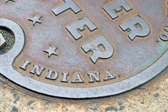
Here's a detail shot of the Bodoni-like letterforms that border the central text. Note how abruptly the serifs begin and end (though it's difficult to tell at this scale, these might even be slab serifs) and how much contrast there is between thick and thin within each letter.
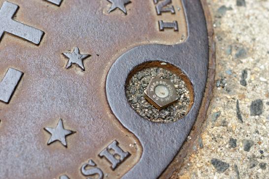
I love how the screw head is also labeled with its place of origin: "Wabash--Ford M.B. Co.", in a tiny, thin sans serif.
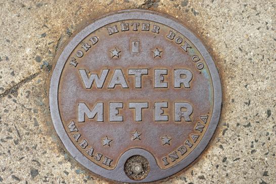
Here's the whole cast-iron cover. It's a gorgeous example of twentieth-century design. If you've seen a similar typeface or spot another interesting example of street typography, be sure to let us know in the comments!
- Log in to post comments.