Mapping Yale, Part Four
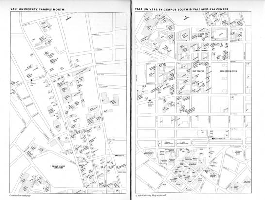
Not until 2001 did Yale reorient its campus map, adopting the common cartographic convention of showing north at the top. A simple black-and-white version, divided into north and south sections, appears on facing pages in the Bulletin series; here’s the 2011 version. It is set in Bell Centennial, a typeface designed in the 1970s for AT&T by Matthew Carter, a senior critic at the School of Art. Intended for use in phonebooks, Bell Centennial is extremely compact and legible in very small point sizes.
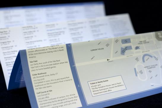
Our office also developed an accordion-fold version printed in Yale Blue for the Visitor Center. It is set in Scala Sans.
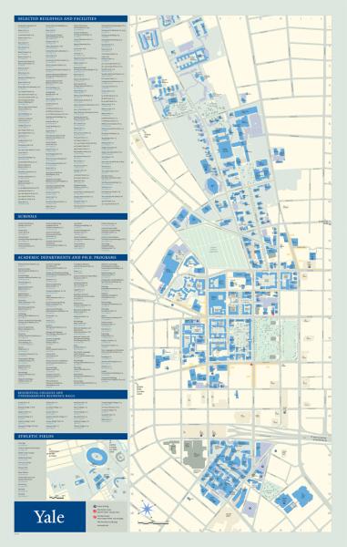
The information graphics firm Reineck & Reineck, in San Francisco, designed the color version that hangs in Yale’s map display cases. It is set in TheSans, a sans-serif typeface that we particularly recommend as a companion to the Yale typeface, which is used for the headings in the map key. The Yale typeface was also designed by Matthew Carter.
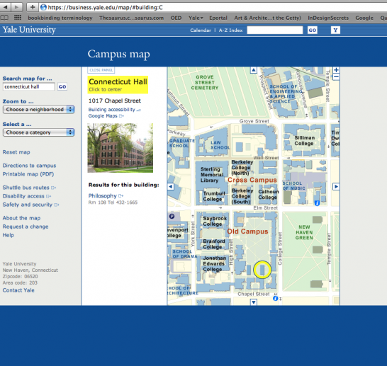
The color map was adapted for Yale’s interactive online map (www.yale.edu/map), designed and programmed by the design firm Linked by Air. Tamara Maletic and Dan Michaelson, Linked by Air’s partners, both graduated from the Yale School of Art, and Dan is a lecturer in graphic design there.
These maps, and several specialized campus maps, are maintained by our office.
For additional images, click on the "Image galleries" link to the left.
- Log in to post comments.