From the archives: Gutenberg Broadside
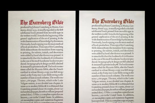
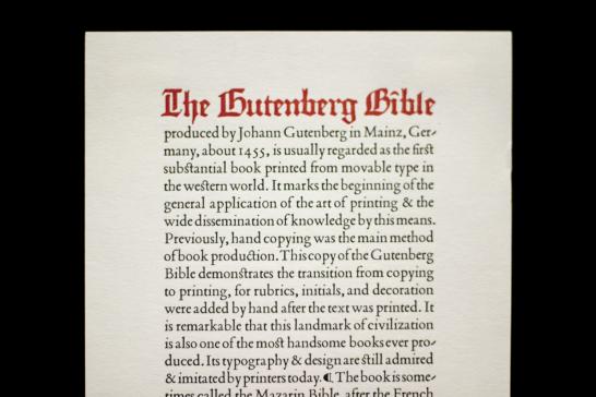
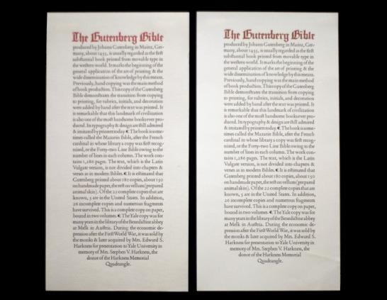
I visited Beinecke Rare Book & Manuscript Library earlier this year and saw the Gutenberg broadside pictured above on the right; I was curious to learn more about its origin. Some research revealed that Roland Hoover, University Printer from 1984-1993, designed the broadside as a keepsake for the library.
Roland sent us the original letterpress version, pictured above, which has a redder title than the digital reproductions that are currently produced. Note how close the wordspacing is throughout this setting: there's barely any space between the ends of sentences and the capital letter of the subsequent sentence, and there's just enough space for the reader to distinguish which groups of letters form words. The tight wordspacing makes each line of text feel like a cohesive unit; the piece is highly legible because the reader's eye has to do little work to follow the path of the text.
The type is justified, and the centered ending hearkens back to classical page layouts from the sixteenth century. (Of course, it also references the Gutenberg Bible's dense and vertical two-column layout.) Other typographic details contribute to the piece's classical aesthetic:
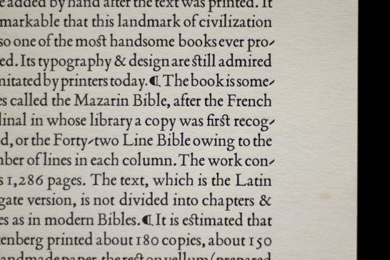
Instead of using paragraph breaks, Roland used the paragraph symbol to designate breaks and ran the lines in -- a formal choice seen frequently in early printing, presumably to maximize paper. He also uses the rather ornamental ST ligature (the letters s and t are linked in "still" and "estimated" -- a more decorative than functional device). Also note the calligraphic, diagonal hyphens, which disrupt the clean right margin less than would a horizontal hyphen.
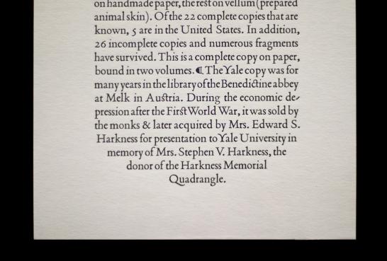
The broadside is set in Poliphilus, a typeface derived from the Hypnerotomachia Poliphili, a celebrated example of sixteenth-century Italian printing. The unusual, gracefully curved capital letter Y is a visual counterpoint to all the other more rational capital letters.
Roland's piece, with its simple but rigorous typography and classical design, will undoubtedly continue to stand the test of time.
- Log in to post comments.