

From the archives: Yale typeface specimen sheet

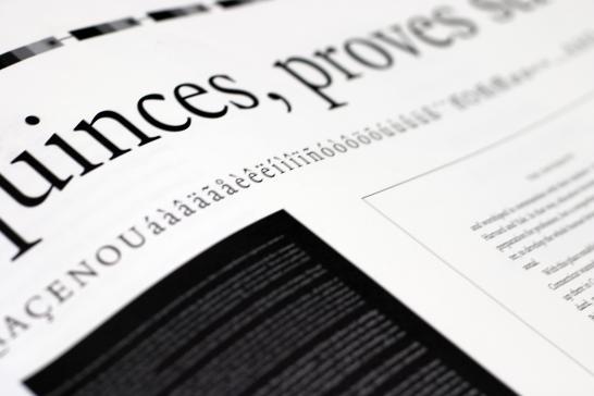
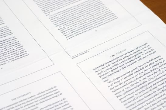
This is the specimen sheet for the Yale typeface. The typeface, designed from 2001 to 2006 by the legendary Matthew Carter, is highly legible, rooted in history, and unique to the University. The specimen sheet features the face in a variety sizes (above), "best practices" for typesetting (such as letterspacing small caps and giving text generous leading), all available special and foreign language characters, and white-on-black and black-on-white settings. There's also a nonsensical phrase ("New farm hand, picking just six quinces, proves strong but lazy") set large at the top of the sheet -- the phrase is a pangram that shows off all letters of the typeface.


Learn more about the typeface on its website, and be sure to check this blog again in the near future -- I'll be writing in much more detail about the history of the typeface and its identifying characteristics.
- Log in to post comments.
