Spotted: School of Architecture lecture posters

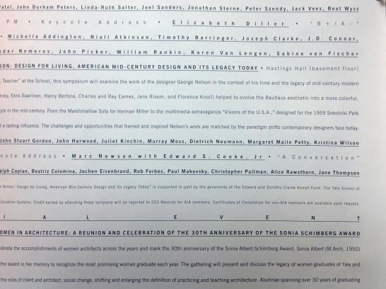
Two posters for the School of Architecture's lecture series hang by the checkout desk of the Haas Family Arts Library. One is purely typographic; the other is more illustrative. I'll focus on the typographic one today.

In terms of design, I love the impact that this solid wall of text creates. There's so much going on: tracking, weight, case, underline, and size are varied to knit a lively panel of letterforms. The trademark of this poster series -- an original "Y" that relates to the form and content of each poster -- stands alone as a signature stamp at the bottom of the page. The relentlessness of this poster is striking in a visual landscape cluttered by compromise. As a poster, however, does this piece succeed? Because it needs to incorporate so much information (a season of lectures, presumably), it would be difficult and illogical to single out a specific event, as do most posters. It certainly succeeds in drawing attention to itself and in establishing the "Y" mark for the poster series. But it's not immediately apparent how (or if) the formal qualities of the poster relate to its content. (Pentagram's other posters for YSOA lecture series are usually a bit more explicit.)

Learn more about the lecture series at the School of Architecture's website, and check back soon to see the other and upcoming posters.
- Log in to post comments.