New work: ROTC Advertisements
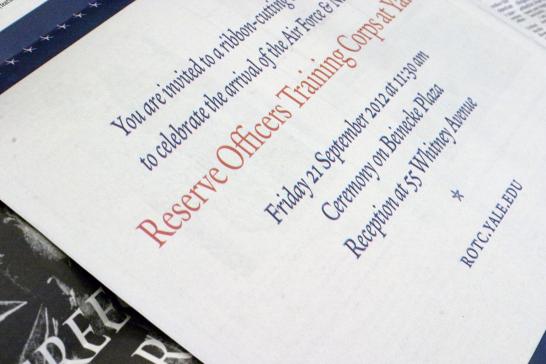
In today's print edition of the Yale Daily News, there's a half-page advertisement that our office designed for the Air Force & Naval Reserve Officers Training Corps ribbon-cutting ceremony this Friday. I used the Yale typeface throughout -- the stars are Yale Roman asterisks!
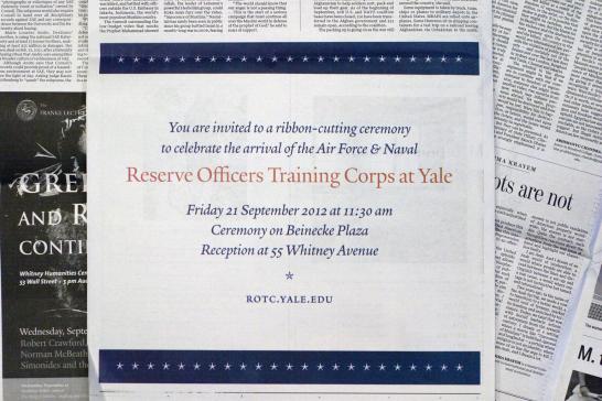
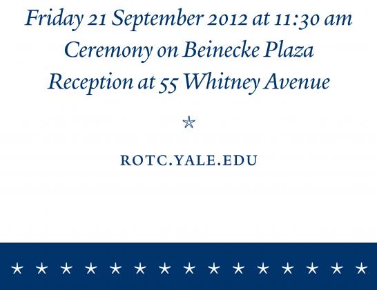
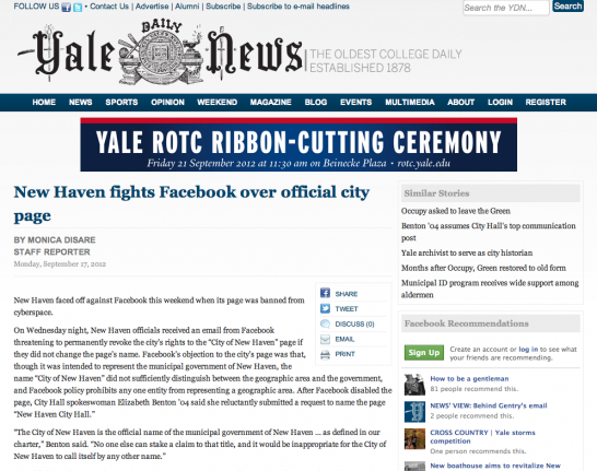
While designing the advertisement for the online edition of the YDN, I had to consider the elements on the rest of the website, including the typographic logo, navigation bar, article title and text, sidebar text, and sidebar advertisements. To ensure that the ROTC ad would stand out, I used bold typography (Interstate Bold Compressed), strong color, and a subtle gradient to give the ad a sense of dimensionality against its "flat" surroundings.

- Log in to post comments.