George Nelson Posters
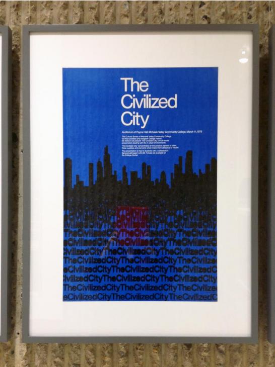
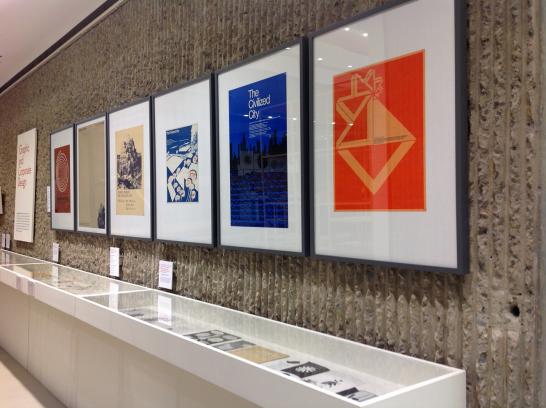
There's more to the George Nelson exhibition at the School of Architecture than furniture and wooden models -- the entire back wall of the exhibition is dedicated to Nelson's work as a graphic designer and art director. The materials focus mostly on Nelson's designs for Herman Miller and the Howard Miller Clock Company, including advertisements, printed brochures, company logos, and more. The work of Irving Harper, Don Ervin, and George Tscherny completed under Nelson's direction is also featured.
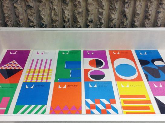
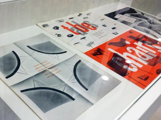
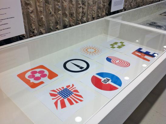
It's worth noting that prohibitively high printing costs at the time mandated a limited palette for print materials. Most of these designs use only one or two colors (plus the white of the paper and sometimes black ink). But this limitation proved to be a boon throughout the process of forging a copororate identity, as it forced Nelson and his design team to use shape, scale, composition, and typography to draw the viewer's attention to the visual punchline. The red-orange color (and the accompanying palette of black and white) that appears frequently in the materials pictured above is now strongly tied to both Herman Miller and to the design era that gave birth to the company.
Visit the gallery in Rudolph Hall at 180 York Street to see the rest of Nelson's work. The exhibition runs through 2 February 2013.
- Log in to post comments.