New work: Emergency Management Guide
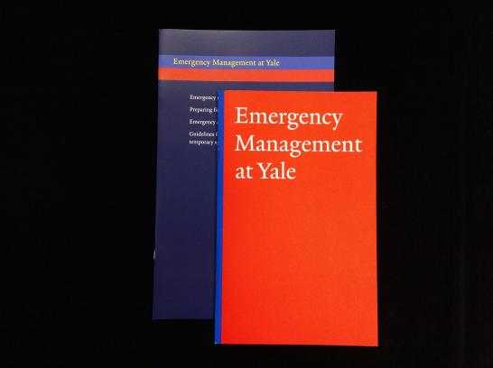
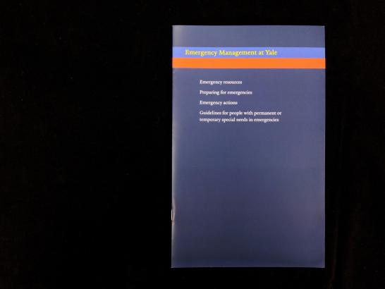
When the Office of Emergency Management needed a new brochure in 2011, our office was called upon to redesign what was originally presented to us as a Word document. My first redesign resulted in the guide shown below. Bright orange-red and blue became a "color identity" for Emergency Management, appearing as signature colors on their website and on promotional posters and cards.
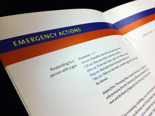
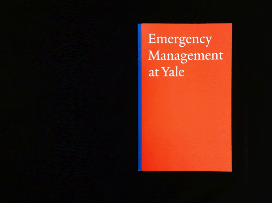
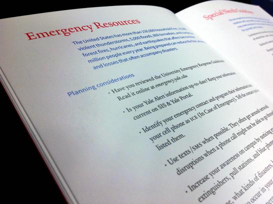
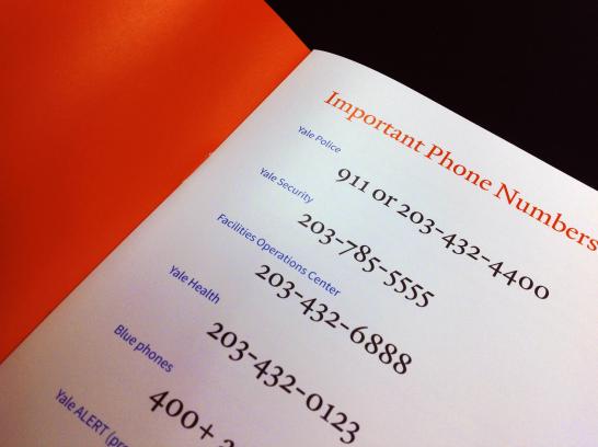
This year, Emergency Management's need to update text and reprint the guide offered an opportunity to revisit the design as well. I employed the signature colors more dramatically to create a sense of urgency appropriate to the subject matter, as well as to denote logical section breaks and more effectively highlight important information. The new guide is not only more visible, it's more portable—just 6 x 9 inches instead of 6.75 x 11—hopefully increasing the likelihood that it will be seen and used in a real emergency.
Thank you to Maria Bouffard, Director of Emergency Management, for involving our office in this project!
- Log in to post comments.