Spotted: Institute of Sacred Music poster
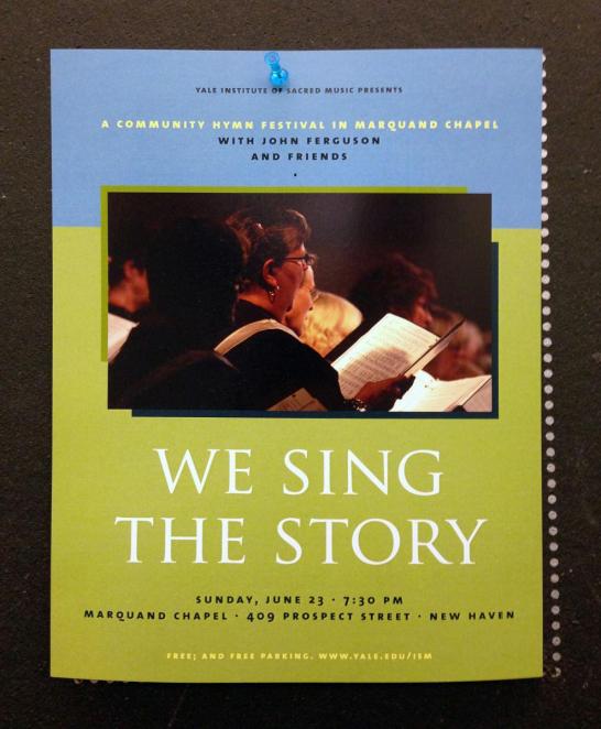
This is a poster for an Institute of Sacred Music concert. The design is understated but thoughtful: it showcases careful typography (old style figures, letterspaced small caps, minimal variation in type styles and sizes, attentive spacing around bullets, etc), an elegant color palette, and compositional consideration.
Though the poster doesn't adhere to Yale's visual identity guidelines to the letter, it does a good job of imparting many of the sensibilities that "Yale design" tends toward. The display text ("we sing the story") shares characteristics with the Yale typeface; the sans serif, TheSans, is a "recommended pairing" for the Yale font. The hierarchy of information is well-ordered, and the use of an image paired with large type draws in viewers from a distance.
There's an interesting optical illusion at the top of the poster: within the group of three small cap lines ("A community hymn..."), the middle line looks like it's closer to the top line instead of evenly spaced between the top and bottom. The yellow text seems to move down while the black text appears to move up. Optical adjustment would help counteract this illusion. The punctuation of the last line ("Free; and free parking. www.yale.edu/ism") is correct but unusual: it unnecessarily draws attention to that otherwise minimal visual event.
This poster is an effective and tasteful advertisement.
- Log in to post comments.