Yale's front page
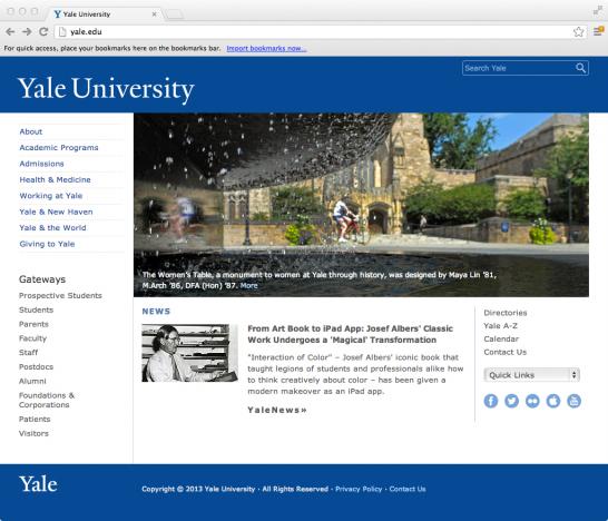
Have you looked at Yale's web front page recently? You might have noticed that it received a subtle facelift.
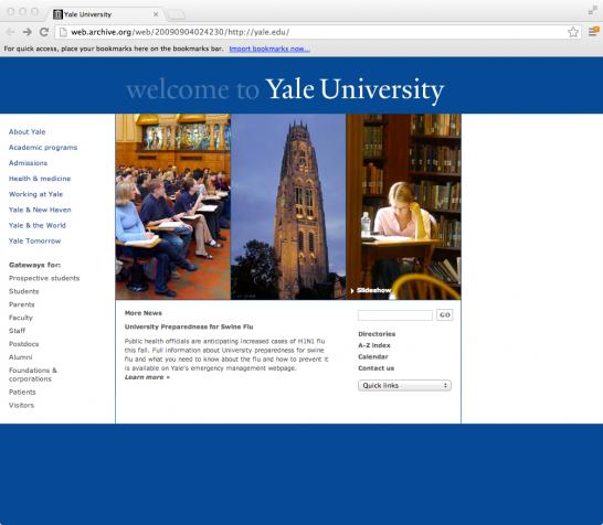
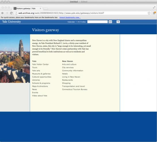
Compare it to the old front page, pictured below:
The new front page retains the old site's structure and content but features a cleaner, lighter look. An extra column has been added to the grid system (or more accurately, the fifth and rightmost column -- empty on the old page -- is now utilized for additional photographic and textual real estate), larger type enhances legiblity, social media icons are given prominent placement, new photography throughout lends a more contemporary feel to the site.
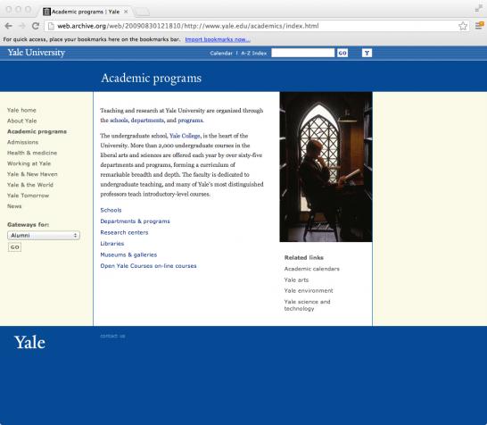
Below are the new and old pages on academic programs:
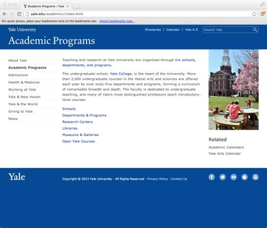
The topbar (containing "Yale University," links to the calendar and a-z index, and the search bar) has been integrated more fully into the new site's header. The elimination of the yellow backgrounds helps pull the site together, too -- the universally white background unifies the visual field.
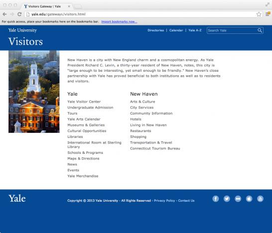
The blue bar headings ("Visitors" on the new page shown above) showcase Drupal 7's web font integration capabilities. The Yale typeface is fully supported throughout the site with automatic replacement of ligatures, automatic typographer's quotes and apostrophes, and widow control.
See the new front page at www.yale.edu. And check back soon for a comprehensive look at the history of Yale's web presence since its 1994 inception.
- Log in to post comments.