In Process: Color matching
The printer’s proof (left) looks pinker than the sketchbook drawing (right), by Kiowa artist Zotom depicting a horse parade.
This proof, of a page from Beinecke’s hand-illustrated copy of Uncle Tom’s Cabin, is veryclose to the original. Nevertheless, excess magenta ink simultaneously makes the color of the cloud more purple and the paper less yellow.
A designer’s job does not end when he/she sends project files to a printer. During production, designers and printers work together to ensure that every aspect of a project is produced to a high standard. Currently, our office is working on the book for the final installment of Beinecke Library’s exhibitions celebrating its 50th anniversary.
So, Rebecca Martz and I headed to Beinecke with our printer’s rep from GHP, Inc. to review how accurately GHP had reproduced the artwork in the exhibition slated to appear in the book. This process is called color proofing. We used ink jet proofs, test prints of each image that appears in a project (see below), which we compared to the original works. From this comparison, we gauge disparities in color. This was perhaps not the most exciting aspect of designing, but it is always critical to producing an accurate and appealing printed reproduction.
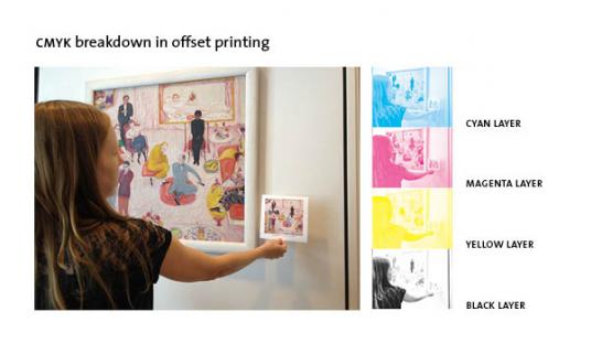
Here, Rebecca holds the printer’s proof up to the original work, hanging in offices of Beinecke Library.
Color discrepancies arise primarily during two phases of production.
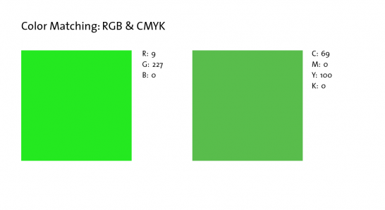
First, colors can change when image files are prepped for printing. Digital photographs of original objects are made using the RGB color model (in which red, green, and blue combine in various proportions to produce the full visible spectrum of color). Printers, however, use the CMYK color model (in which cyan, magenta, yellow, and black inks reductively combine to produce the printed color spectrum). Since many colors that exist in RGB lack a CMYK cognate, converting RGB files to CMYK files can alter colors and distort the color profile of images. (see the below color swatch comparison).

This example comparison shows the closest CMYK approximation of the RGB color (9,227,0). The difference is very noticeable.
The second major source of color discrepancy results from the printing process. In offset printing, images are split into four separate color layers (cyan, magenta, yellow, and black), which are layered one on top of the other by the printing press. There is an almost infinite combination of variables in this apparently simple layering of inks, requiring a great deal of mechanical adjusting during printing and visual compromising along the way to ‘matching’ the approved printers proof.

Today, we found that the proofs were too red and often too dark. To address this, GHP will subtract a small percentage of magenta ink and add a little yellow back into the process. GHP will also try to lighten the midtones and increase overall contrast to brighten up the highlights in many of the images. The printer’s rep took notes to guide the GHP color department through the necessary adjustments to the image files.
Sometime next week, an updated set of proofs will take us back to Beinecke for round two of color matching. To learn more about the Beinecke’s 50th anniversary and exhibitions, click here.
- Log in to post comments.

