Commencement 2013

Woolsey vitrines.

Congratulations, class of 2013! We designed four posters to celebrate. They're hanging in the vitrine cases outside of Woolsey Hall at the corner of College & Grove streets. Two designs can be seen in detail below. 

Harkness Tower poster.

The woodcut of Harkness Tower seen above is by Jacques Hnizdovsky, a midcentury printmaker who made at least two Yale woodcuts.

2013 colorblocked poster.

SML Selin Courtyard

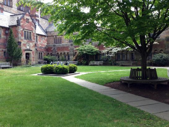
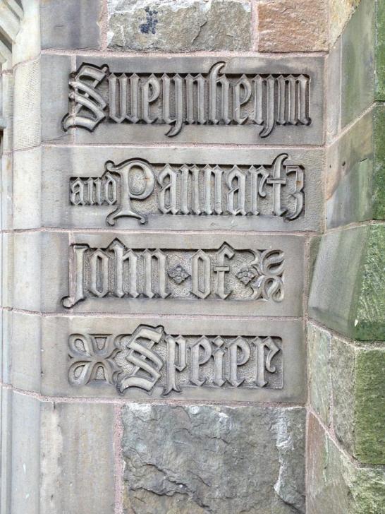
Have you ever looked closely at the stone carvings that decorate the Selin Courtyard in Sterling Memorial Library? If you've never visited the courtyard, it's worth a trip. Find it by taking a right at the circulation desk after coming through the main entrance on High Street (the door will be on your right), or enter through the Wall Street entrance, walk down the corridor, and go through the door on your left.

Selin Courtyard in SML.

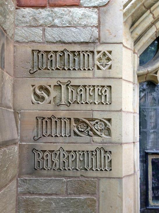
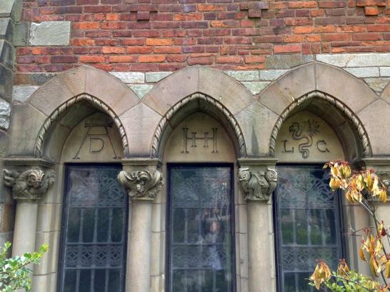
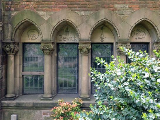
After you enter, take a look at the windows to your right. There, you'll see the names of many famous printers, including Nicholas Jenson, William Caslon, John Baskerville, and Giambattista Bodoni (all of these printers happen to have typefaces named by or for them: Jenson, Caslon, Baskerville, and Bodoni).

Ibarra & Baskerville.

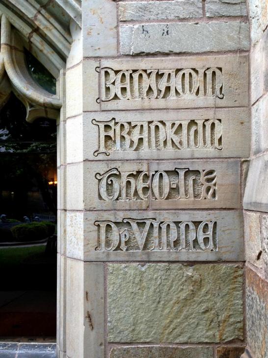
Note how Theodore Low De Vinne's inscription (below) has been rendered in a version of the eponymous De Vinne typeface with its vaguely Lombardic letterforms; most of the other carved names use blackletter forms.

Franklin & DeVinne

Sweynheym+Pannartz & John of Speier.

The wall that you face immediately upon entering the courtyard pays tribute to famous artistic printmakers, including Albrecht Durer, Hans Holbein, Francisco Goya, and William Blake.

Durer, Holbein, Cranach.

Blake, Bewick, Utamaro, Whistler.

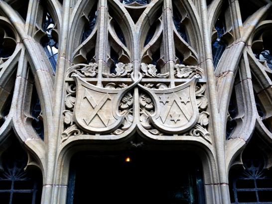
Every mark and phrase in the courtyard is historically significant. According to Volume 5, Number 4 of the Yale University Library Gazette (published in April 1931), the Southeast Entrance (pictured below) pays tribute to "Gutenberg and his press, with the...inscription taken from the colophon of Johannes Balbus's Catholicon printed in 1460, and attributed to Gutenberg's press... Two shields, one on each side of the arch of the entrance: Head of Gutenberg, 'In the beginning was the Word.' Four bosses, in the arch: mallet and shooting-stick, galley, ink-ball, type mould."

Southeast Entrance to Selin Courtyard.

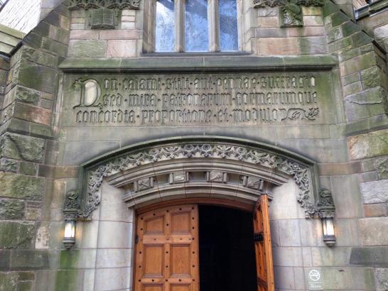
(The Latin inscription reads "Non calami stili aut pennae suffragio sed mira patronarum formarumque concordia proportione et modulo". Latin scholars, feel free to leave your translations in the comments!)

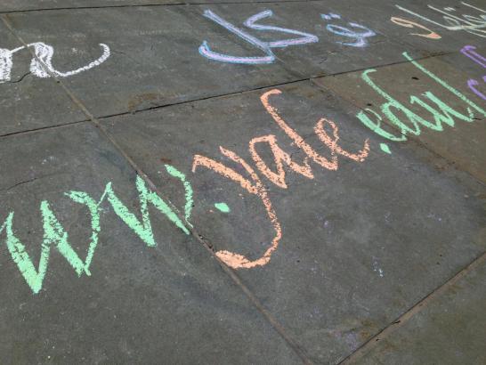
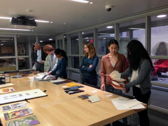
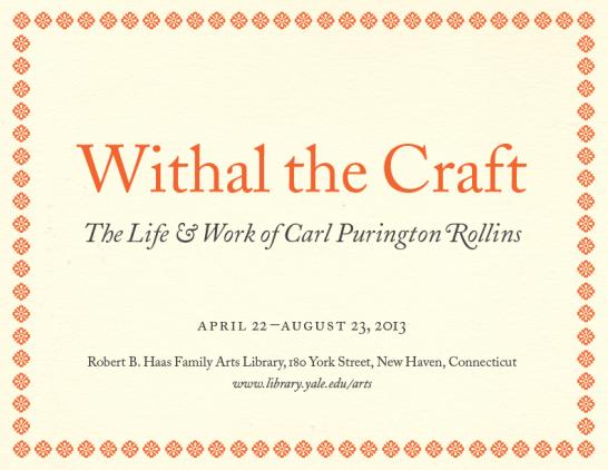
See the courtyard and unravel more of its mysteries yourself. Learn more about its history and the significance of its ornament in the Yale University Library Gazette, which you can access through JSTOR.

Selin Courtyard detail. 

Spotted: Calligraphy in front of SML

Calligraphy detail.

Have you seen the calligraphy in front of Sterling Memorial Library? Go check it out before the rain washes it away!

Calligraphy detail.

Calligraphy detail.

Yale's Calligraphy Club is responsible for this beautifully executed installation. As evinced in these photographs, the club has members experienced in Latin, Chinese, and Arabic calligraphy.

Calligraphy.

This giant "poster" is another example of something ephemeral that adds so much to the University's rich visual landscape.


On view: White Cube, Green Maze

"White Cube Green Maze: New Art Landscapes" is on view at the School of Architecture right now. The exhibition closes tomorrow, so be sure to check it out this weekend while you still can!

When you walk into the exhibition space at 180 York Street, you're greeted by a striking facade with a doorway cut out:

WCGM entrance.

WCGM entrance, continued.

WCGM entrance text detail.

The entry "cube" immerses the viewer in an environment that serves as a dramatic entry point to the rest of the exhibition. WCGM exhibition overview.

WCGM text panel detail.

WCGM exhibition panel.

WCGM text panel detail.

mgmt. design's thoughtful exhibition graphics are worth consideration in their own right. It's great to see such attention to typographic detail—hanging punctuation, careful rag adjustment, fairly tight leading with tight wordspacing (which together make for a highly legible line)—combined with a sense of play. Color and scale variance for all of the signage keeps the show's graphics looking cohesive but never boring.

WCGM wall panel text detail.

Learn more about Yale School of Architecture's exhibitions on their website.


Spotted: Jamming for Jane poster

Jamming for Jane poster

I saw this screenprinted poster on Cross Campus this morning. It's eyecatching for obvious reasons: it's neon green and enormous (and presumably violates the 8.5x11" size limit on posters):

Jamming for Jane size comparison.

Though it's not typographically rigorous (multiple typefaces and sizes, several alignments, uneven spacing, uneasy relationships between type and margins), the piece succeeds in part because of its strong typographic hierarchy. There's an unambiguous title ("Jamming for Jane"), distinct small text (confined to the bottom half of the page), and text that is intermediate in both size and importance. 

Jamming for Jane type detail.

The evidence of the handmade in this poster is part of what makes it appealing, but more consideration could have been given to craft. There are many instances where ink has bled into smaller sized letters, rendering them nearly illegible. Both heavy and low ink coverage at the edges of the poster have caused a ragged edge and something like reticulation where ink has pooled on top of itself. While this messy, playful style is certainly its own kind of visual language—and one that can be used to great effect—it feels slightly inappropriate for the content of this poster, which seeks to advertise a fundraising concert for a victim of the Boston Marathon bombings. That said, we can all appreciate the amount of labor, time, and hand work that went into the design and production of these posters. It's great to see that someone gave so much consideration to such an ephemeral medium!

Jamming for Jane type detail.


Lohmann Prizes 2013

This year's Lohmann Prizes were chosen last Friday. The Prizes, which celebrate excellence in undergraduate printing and design, were awarded to eight students. All of the judges noted that this year's submission pool was particularly strong. We had a hard time choosing the winners!

Lohmann Prizes awards ceremony.

Cindy Hwang BK '15 was awarded first prize in the digital category for her two booklets "Politics and the English Language" and "The Simplification of the Chinese Script," seen below. We appreciated her care in selection of materials, attention to typographic detail, and thoughtful fit of form and content.

Cindy Hwang, sample spread.

Cindy Hwang, sample spread.

Cindy Hwang, type detail.

Below: detail from Cindy Hwang's "Politics and the English Language."

Cindy Hwang, type detail.

First prize in the letterpress category was awarded to Annie Wang BK '13 for her artist's book "Miss Behavior." The innovative binding and multi-directional reading format enhanced the content of the book, which explored attitudes toward women throughout time.

Annie Wang, binding detail.

Annie Wang, type detail.Annie Wang, type detail.

Annie Wang, binding detail.

Honorable mentions were awarded to Austin Lan TC '13 for her posters promoting Yale's mental health services; Greta Parnes DC '14 for her letterpress carousel book featuring an excerpt from The Waves by Virginia Woolf; Jacqi Lee MC '14 for her digital body of work, which included the Fall 2012 issue of the Yale Literary Magazine and her book "Giorgio Morandi: Meticulously Composed"; and Andrew Sotiriou SY '13, Paul Doyle BK '13, and Isabella Huffington DC '14 for their design of the program for Cinderella: The Light of God.

Austin Lan's posters.

Above: Austin Lan's posters. Below: Greta Parnes's carousel book.

Greta Parnes's carousel book.

Greta Parnes's carousel book.

Below: Jacqi Lee's Morandi book and text detail from the Yale Literary Magazine.

Jacqi Lee's Morandi book.

Jacqi Lee, text detail.

Below: Cinderella program designed by Andrew Sotiriou, Paul Doyle, and Isabella Huffington.

Sotiriou, Doyle, and Huffington's Cinderella program.

Cinderella interior spread.

There were many other incredible submissions—you can see a sampling in the image gallery to the left.

Thank you to our judges (Molly Dotson, John Gambell, Basie Gitlin, Martha Highsmith, Michael Morand, and Richard Rose) for their time and input, and to Jae Rossman of Arts Library Special Collections for helping coordinate the event and allowing us to use the space.

Richard Rose.

Above: Richard Rose engrossing certificates for the prizewinners.

Withal the Craft: The Life and Work of Carl Purington Rollins

For the past year, I've been spending time in Special Collections at the Haas Family Arts Library researching the life of Carl Purington Rollins, Yale's first University Printer. The result of that research is now on view in the exhibition space in Haas in the form of an exhibition called Withal the Craft: The Life and Work of Carl Purington Rollins.

CPR title panel.

The opening reception for the exhibition will take place from 5 to 6.15 pm today in Haas. All are welcome to enjoy some food and drink and look at the show. If you can't make it this afternoon, the exhibition will remain on view through 23 August 2013.

Read more about the exhibition on the Haas Family Arts Library website.


Spotted: XS Collaborative Poster

XS Collaborative poster.

This bright poster caught my attention as I walked across Cross Campus this morning. Its neon colors (and the gradients formed by their transitions) are unlike the familiar agglomeration of so many sheets of plain text on copy paper and photographic-toned images. It is perhaps the only poster on this bulletin board printed full-bleed (the color extends to [and, conceptually, beyond] the edges of the paper)—note how there's no telltale white border around its edges, which marks most of the other posters as having been printed on standard letter-size paper likely off of a cluster printer. Most importantly, one compositional element dominates the picture plane: in large and roughly hewn lowercase, the letters "xs" dominate without explanation or apology. All supplementary information is relegated to small black text at the poster's top and bottom margins. The designer was rightly confident that the poster itself would serve as a point of entry for the viewer.

XS collaborative type detail.

Imagine how this poster might look if its type were given a treatment similar to that familiar scheme used on many of the other posters on this bulletin board: if all of the information were given visual weight commensurate with its conceptual importance, nothing would stand out. The dramatic shift in scale between background texture (color, xs, photographic reproduction) and informational essentials (date, time, place, etc.) impels the viewer toward the poster for a literal closer read. 

XS Collaborative type detail.

There appear to be slight misregistrations of color screens on this poster: there's a small gap where the pink-to-blue xs doesn't quite align with its blue-to-pink photographic background. There are also two dark blots of ink on the lower left leg of the "x." These imperfections reveal the process by which the poster was created (presumably hand-pulled silkscreen -- one screen each for the two gradients and one screen for the black text) or are perhaps an ersatz reference to the traditional handcrafted method. 

The XS Collaborative's event will be held tomorrow at 5.30 pm at 202-208 College Street. 

Spotted: Yale ACLU poster

I saw this red and black poster for the Yale chapter of the ACLU on a Cross Campus bulletin board this morning. 

Yale ACLU poster.

The densely packed type arranged in a rectangular composition immediately reminded me of Carson Evans' winning poster design for the Van Sinderen Book Collecting Prize—her poster and today's ACLU poster place chaotic type inside an ordered form. 

Detail of Yale ACLU poster.

Neither of these posters adheres to traditional typographic conventions: multiple point sizes and weights of type are used (sometimes in the same sentence), tight leading makes individual lines difficult to read, and there is no consistent adherence to alignment axis. Despite—or because—of this, both posters are eye-catching in their reliance on typography and color alone to draw and hold attention.

Dr. Bronner's castile soap label is a classic example of similar typographic texture used to great effect. The parameters for design are even more limited: only two colors are used and only two alignment schemes are present. This composition relies on minimal negative space and on relative scale/size of type to create a hierarchy of information.

Dr. Bronner's soap label.

Image courtesy of drbronner.com.

2x4's identity and packaging design for skincare company Malin+Goetz also uses typography to create a distinctive texture through diminishing weight and through color. 

2x4's web design for Malin+Goetz.

Image courtesy of 2x4.org.

It's fascinating to see how a similar concept can be taken in such different directions even within a strict set of design parameters.