Seen around campus...

I've noticed a number of striking student-designed posters around campus in the past month or so. The posters, seen below, are distinguished by their strong use of image with type (in some cases, the type itself is the image) and the presence of negative space (type and image alike have plenty of "room to breathe"). Obvious editorial consideration—the distillation of information down to its most essential elements—allows color and form to dominate the page, making for effective advertisements.

MFA poster.

MFA poster detail.

Above: School of Art lecture poster. Seen in Green Hall, 1156 Chapel Street.

Reggie Wilson poster.

Reggie Wilson poster detail.

Reggie Wilson poster detail.

Above: Yale Dance Theater poster. Spotted on a Cross Campus bulletin board.

The Void poster.

The Void poster detail.

The Void poster detail.

Above: The Void senior project poster. Seen at Yale Station.

Terry Allen poster.

Terry Allen poster detail.

Terry Allen poster detail.

Terry Allen at Yale University Art Gallery poster designed by Jessica Svendsen. Seen on Cross Campus.


Yale College New Music

Yale College New Music materials.

Our office designed the program and postcard invitation for Yale College New Music's February concert, Choral Fest IV!. The concert, which featured special guest vocal octet Roomful of Teeth, was held in Beinecke Library as part of its 50th anniversary year celebrations.

Yale College New Music materials.

To ensure a strong "family resemblance" among all materials related to this year, we used the color scheme, typography, and logo of Beinecke's 50th anniversary identity (also designed by our office). We introduced layered type on the cover and a secondary alignment scheme (rotated and vertically centered) for content type descriptors (program, composers, etc.) as a typographic reflection of the program's experimental content.

Yale College New Music interior spread.

Photographs courtesy of Rebecca Martz.

Beinecke's 50th Anniversary

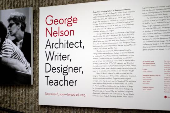
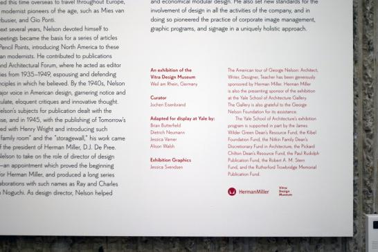
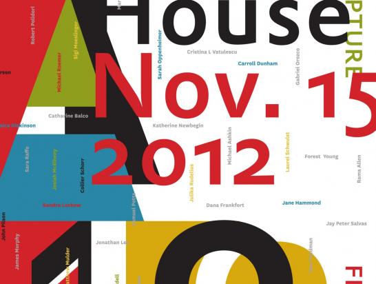
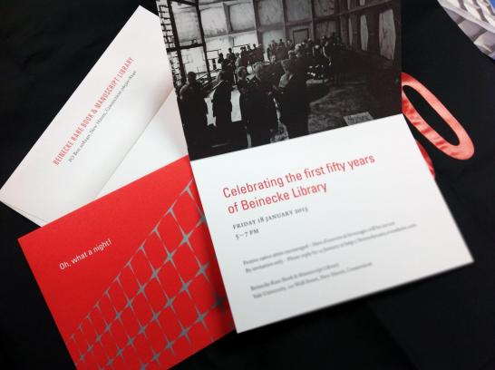
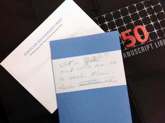
Y Design is alive and well! We've been very busy over the past two months with work for Beinecke Library's 50th anniversary year and several other major projects that you'll read about soon on this blog. Here are a few snapshots of our designs for Beinecke.

Beinecke Designs.

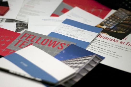
We designed the invitation for January's 1963-themed opening party...

Oh, what a night!

as well as the invitation for an event with United States Poet Laureate Natasha Trethewey, who gave a lecture at Beinecke...

Trethewey invitation.

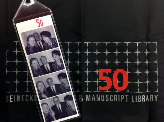
and the reusable black bags that are visible in the background in the two photographs above. We worked with Baggu to create a commemorative, useful, and sustainable giveaway for the opening party: two variants of our 50th-anniversary logo for Beinecke appear on different versions of the reusable tote bag.

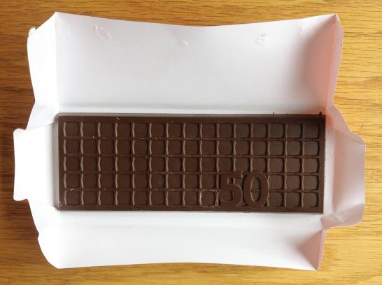
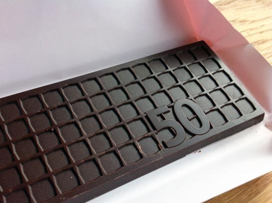
We also had the pleasure of working with Totally Chocolate to create a Beinecke chocolate bar (also given away at the opening party). 

Wrapped chocolate bars.

The unwrapped bar

Chocolate bar detail.

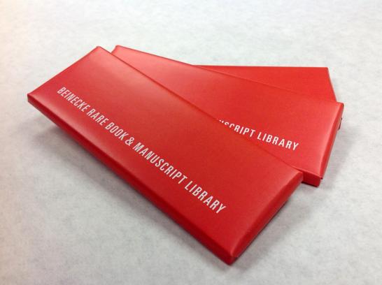
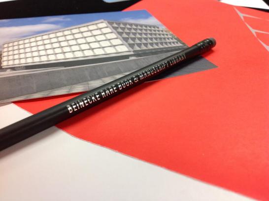
We worked with Ticonderoga to create custom pencils that match the anniversary logo in color and typography.

Anniversary pencil.

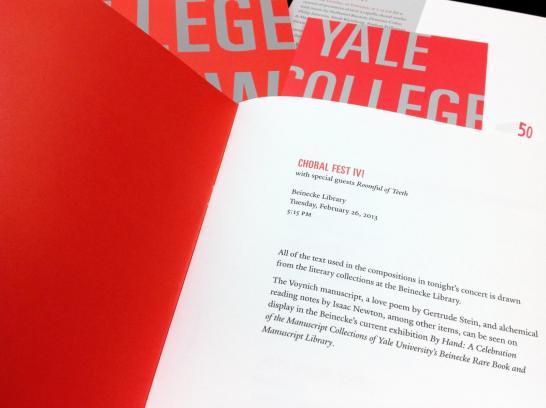
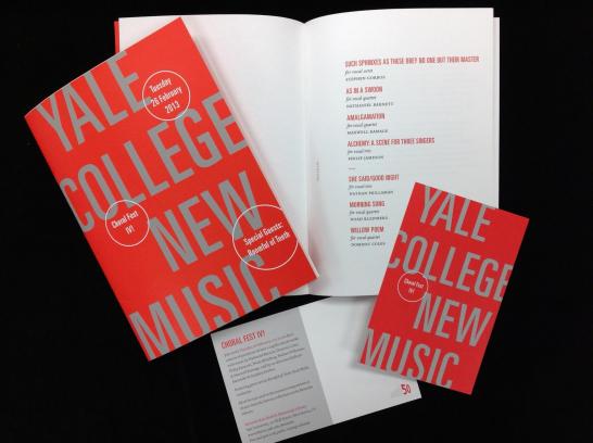
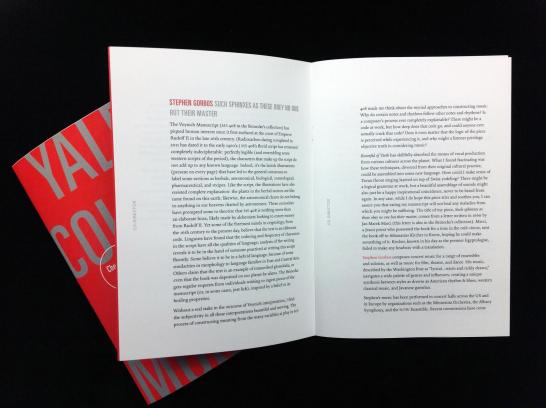
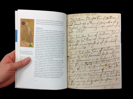
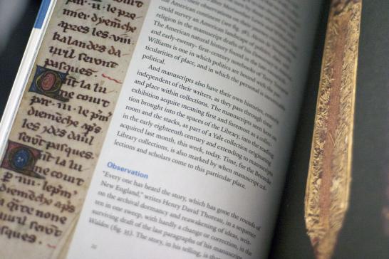
Rebecca designed the booklet for By Hand, the first of three major exhibitions this year at Beinecke. The exhibition is on view through April 29, 2013, and showcases a sampling of Beinecke's incredible manuscript holdings. 

By Hand interior spread.

By Hand interior spread.

By Hand interior spread.

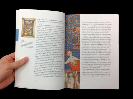
She also designed a broadside that chronicles major anniversary events, a series of postcards, stanchion signs for the exhibition, the exhibition banner, and much more.

Here's three-quarters of our office (we missed you, Lesley!) at the party.

OUP at Beinecke.

Thank you to GHP, the printer of many of these pieces; Yale Printing & Publishing Services; our other vendors (Baggu, Totally Chocolate, Ticonderoga); and the staff of Beinecke Rare Book & Manuscript Library for an incredible night that kicked off what promises to be a fantastic year. Be sure to stop by the library to see the current exhibitions and to pick up some of these commemorative pieces. Happy 50th, Beinecke!


Yale University Art Gallery expansion opening

YUAG booklet cover.

You've probably heard that the greatly expanded Yale University Art Gallery opens to the public today after fourteen years of planning and construction. The renovations -- including the restoration of the "Old Art Gallery" (Swartwout Building) and Street Hall -- double the space of the gallery and allow for the display of more than 4,000 additional artworks. The post-renovation YUAG is truly incredible and overwhelming in only the best of ways: aside from all of the art, the museum itself is an aesthetic journey. Careful integration of original architectural features with contemporary design and engineering, strong color, consistent typography for label and exhibition graphics, and thoughtful placement of the artworks all contribute to YUAG's world-class experience. Today I'm writing about just a small part of all the preparation that went into YUAG's grand reopening: two pieces of print collateral.

YUAG Floor Plan cover.

YUAG Floor Plan interior.

YUAG Floor Plan detail.

Chris Sleboda, Director of Graphic Design at YUAG, and his team designed an energetic and visually clear identity system for YUAG, which they applied to everything from the museum's floor-plan pamphlet (pictured above) to exhibition graphics to a giveaway booklet (pictured below). Color (predominantly bright blue, gold, black, and white) is used to great effect in both the floor plan and the booklet: informational structure and elements of the book are highlighted consistently, which allows the viewer to immediately understand how elements are grouped and/or related.

 YUAG booklet text spread.

YUAG booklet table of contents.

YUAG booklet text detail.

The excellence of these two publications speaks to the level of detail and care that went into the entire renovation. See it for yourself at the grand opening today -- ribbon cutting happens at noon!

YUAG booklet image spread.

Van Sinderen Prize 2013

Have you seen this year's Van Sinderen Book Collecting Prize poster around campus? The winner in this year's poster competition was Carson Evans ’13 of Branford College. For more information about these prizes, please see our website.

2013 Van Sinderen poster by Carson Evans

George Nelson Posters

George Nelson graphic design, poster.

There's more to the George Nelson exhibition at the School of Architecture than furniture and wooden models -- the entire back wall of the exhibition is dedicated to Nelson's work as a graphic designer and art director. The materials focus mostly on Nelson's designs for Herman Miller and the Howard Miller Clock Company, including advertisements, printed brochures, company logos, and more. The work of Irving Harper, Don Ervin, and George Tscherny completed under Nelson's direction is also featured.

Herman Miller brochures designed by George Nelson.

Herman Miller advertisements designed by George Nelson.

Logos designed by George Nelson.

It's worth noting that prohibitively high printing costs at the time mandated a limited palette for print materials. Most of these designs use only one or two colors (plus the white of the paper and sometimes black ink). But this limitation proved to be a boon throughout the process of forging a copororate identity, as it forced Nelson and his design team to use shape, scale, composition, and typography to draw the viewer's attention to the visual punchline. The red-orange color (and the accompanying palette of black and white) that appears frequently in the materials pictured above is now strongly tied to both Herman Miller and to the design era that gave birth to the company. 

George Nelson posters. 

Visit the gallery in Rudolph Hall at 180 York Street to see the rest of Nelson's work. The exhibition runs through 2 February 2013.


Spotted: George Nelson Exhibit at the School of Architecture

George Nelson title panel.

The current exhibition at the School of Architecture is a multidimensional retrospective of George Nelson's designs. Featuring furniture, print design, video, and constructed models, the exhibition provides an immersive view of the iconic zeitgeist that Nelson helped create. 

George Nelson model.

George Nelson exhibition label.

This traveling show was organized by the Vitra Design Museum in Weil am Rhein, Germany. In its Yale adaptation, the show is captioned by School of Art graduate student Jessica Svendsen's bold, simple graphics.

George Nelson wall installation.

George Nelson labels.

George Nelson clock wall.

George Nelson printed matter.

George Nelson chairs.

The show is up through 26 January 2013. I highly recommend going to see it in person -- photographs really don't capture the experience of being surrounded by these outstanding examples of American modernist design.

George Nelson exhibition credits.


Spotted: Yale School of Art Open House Poster

School of Art Open House poster, detail.

I noticed this colorful poster hanging by the information desk in the Haas Arts Library. It advertises Thursday's open house at the Yale School of Art. The poster is particularly effective in its clear presentation of several levels of information hierarchy: the designers had to distinguish between the main title (Yale MFA 2013-14), secondary headings (website, event title, date), subsidiary information (QR code, Dean Robert Storr's message, department names), and background texture (faculty names, color, and shape). 

Open House poster, detail.

The poster was designed by Henk van Assen, a critic in Yale's graphic design program, with Loide Marwanga, YC '10, and Sarah Eidelson, YC '12. The dimensionality of this poster -- a sense created by the overlapping/cut-out/stencilled letters in the background -- complicates the picture plane and draws the viewer in to interact with the complexity of the poster's information.

School of Art Open House poster, detail.

School of Art Open House poster, detail.

In Henk's words, "The fragmented design and typography tries to accomplish a visual 'voice' that represents the School of Art as a dynamic, productive, inquisitive institution where, in Dean Storr's words: 'students have work to do.' In addition to attracting general attention, the color helps to connect the names of faculty to the respective concentrations within the school. The relatively large scale differentiation between overall message and faculty names generates both a spatial experience and provides a visual texture that only becomes clear when looking up close. The QR code connects directly to the applications page on the web site."

Open House poster in Haas.

Find out more about the School of Art's MFA Open House on their website.

PDF-derived images courtesy of Henk van Assen.

Election Day 2012

Election Day 2012

New work: New Directions for Digital Scholarship

Fall NDDS poster.

I designed this poster for the New Directions for Digital Scholarship program. Sponsored by Yale University Library, NDDS is a new forum convening once each semester to discuss the emergent field of digital scholarship and its impact on research in the humanities and social sciences.

NDDS's identity was inspired by the digital language of pixels and a humanities-inspired color palette.

Today's event was canceled due to Hurricane Sandy, but it will be rescheduled for the spring semester. At that point we'll roll out that season's designs. Here's a sneak preview of the color scheme for spring...

NDDS spring poster preview.

Check back next semester to see the full range of publicity materials for the spring chapter of New Directions for Digital Scholarship!