Spotted on campus: Saybrook College gates on Elm St

Saybrook gate.

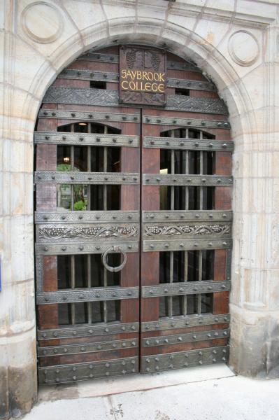
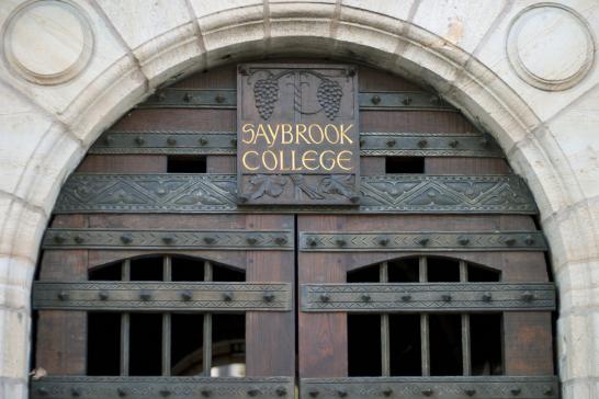
If you've walked past Saybrook College on Elm Street this year, you might have noticed that its gates look different than in years past. Small changes — gold letters, a warm finish — reveal to the careful viewer that in fact a significant change has taken place.

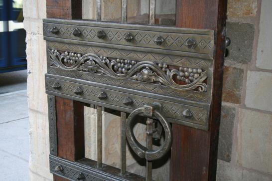
The gates were originally designed and manufactured by Samuel Yellin, who was perhaps the most accomplished artist-blacksmith of the early twentieth century in this country. His work can be seen all over campus — some notable sites include the gates inside of SML, the intricate exterior gates of the Hall of Graduate Studies, and the Memorial Gateway at the High Street entry to Branford College. Yellin's mastery of raw material combined with his understanding of architectural ornament and site context made his work inimitable in its craft and highly sought out by universities, private homeowners, and museums all over the country.

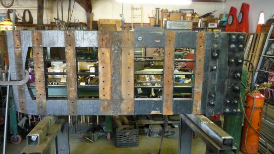
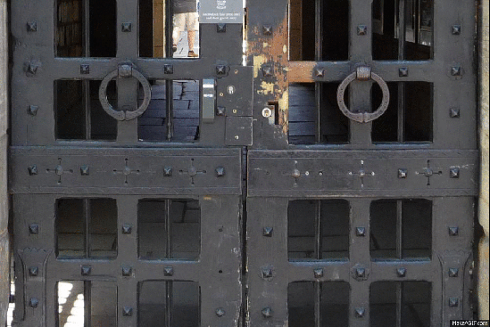
Yellin's Saybrook gates showed inevitable signs of wear after decades of use. Rust, wear, and the visual and physical damage wrought by incompatibility with modern security systems were three of the most serious — and visible — problems affecting the gates. The architects needed to find a way to bring the gates back to full functionality while preserving the artistry of the original work.

Before and after.

The gate work was part of a larger project managed by Babbidge Facilities Construction (founded by Alex Babbidge TD '85) that was overseen by Project Manager Justin Shanley TD '89. In collaboration with Hammersmith Studios (the project's restoration blacksmith), and Exactitude, Inc. (the wood restorer), the Project Architect at Christopher Williams Architects began by assessing the extent of the damage to the original gates, which are made of Swedes' iron (highly refined wrought iron used for ornamental work in the early twentieth century) and teak. After literally uncovering the damage and diagnosing what needed repair and what required replacement, the metal and wood restoration craftspeople worked to maintain the original aesthetic of the gates while bringing their structural integrity up to modern standards.

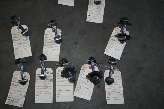
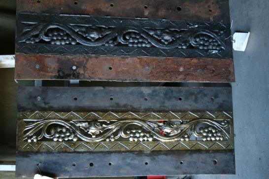
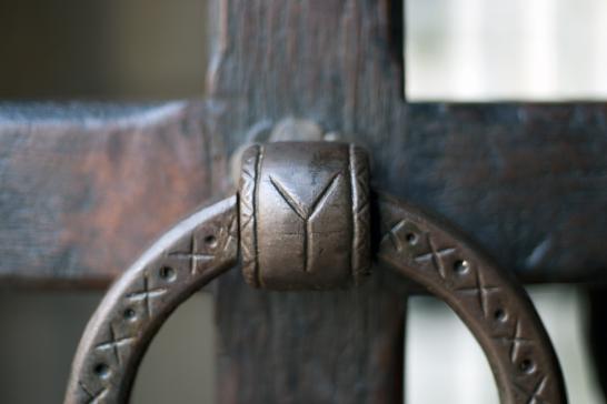
The gates, their hardware, and their hinges were all restored or updated. One new ring handle was forged, and metal panels damaged beyond repair were replicated. The load-bearing properties of the stone portal arches were examined, and additional hand-forged stainless steel pintles and hinges were added to better distribute the gates' weight. The carved plaque over the west gate was restored to its original gold-leaf "Saybrook College" lettering. The gates were finished with an historically accurate finish that produces a rich, matte appearance and will require little effort to refresh over the years.

In the words of Joe Chadwick, MArch '82, the Project Architect from CWA for this project, "Repairs in the metal work are indistinguishable from the original work in terms of technique and texture. Wood repairs are neat and honest and sit comfortably in the background with the hand worn edges...the quality of the finished work speaks volumes to the talents of the craft-workers involved."

(Images courtesy of Christopher Williams Architects and Hammersmith Studios.)

Stripped wooden gate.

Assorted gate hardware.

Metal panel detail.

Handle detail.

Gate with metal ornament, on site.

The gates!

New work: History of the Book materials

History of the Book promotional materials.

The Yale Program in the History of the Book, a public lecture and seminar series organized by the Beinecke Library and the Department of English, needed a suite of promotional materials. Rebecca Martz created the identity for the series, which explores "the materiality of the written word over time and across cultures." She designed posters, a bookmark, a postcard, a tote bag, a t-shirt, and assorted electronic elements, each featuring at least one "Y" letterform. The Ys were drawn from items in the Beinecke's collections. The repetition of the Y and the blue and red color palette provide clearly recognizable and unified visual branding for the program.

History of the Book poster detail.

History of the Book bookmark detail.

History of the Book tote bag.

Visit the History of the Book website for more information.

History of the Book t-shirt.

Trip to the New Haven Register building

New Haven Register machinery.

On Monday, our office visited the New Haven Register building. This enormous old building will be the site of ArtSpace New Haven's City-Wide Open Studios Alternative Space weekend. Our office is participating in CWOS this year, and we'll be exhibiting in the alternative space on Saturday, 20 October, and Sunday, 21 October, from noon to 5 pm. Be sure to come by to see samples of our printed work, a keepsake related to crystal (this year's CWOS theme), and all of the other fantastic artwork by local artists. Until then, check out these photographs of the amazing Register building and its vintage machinery.

More machinery inside of the Register building.

A printing press.

Learn more about ArtSpace and City-Wide Open Studios at their website.

Rebecca explores the press!


Spotted: Purple Crayon noticeboard on Elm St

Purple Crayon noticeboard in full.

The Purple Crayon's noticeboard outside of the postal station at the corner of Elm & High St is ingenious. It exemplifies the best qualities of a successful poster: it is simple, eye-catching, and memorable, and it directs the viewer to action. Even a viewer unfamiliar with the story of the purple crayon understands that something about this crayon is related to improvisation. The inelegant lettering enhances the unstudied, childlike effect of the poster -- appropriate, given the improv group's namesake. The poster is a living example of the graphic and conceptual design principle "less is more."

Purple Crayon noticeboard in situ.

The Purple Crayon's website landing page.

The Purple Crayon's website landing page is also wonderfully minimalist. See it for yourself, and be sure to catch their improv comedy shows on and beyond campus!

Spotted: Installation on Cross Campus

Installation on Cross Campus.

A mysterious take-over of the bulletin board on Cross Campus has appeared! Someone seems to have covered the flyers with a blue mask of paint. Perhaps it's an homage to Yale Blue (needs more blue and black to get the color right!) or to the similarly colored construction netting nearby outside of Berkeley College. Whatever the motivation, the effect is arresting. There's something very pleasing about the repetition of the blue and the resultant borders created by the original flyers.

Cross Campus Installation, detail.

Cross Campus Installation, site view.

Check it out while you can -- I doubt this will be up for long.

Spotted: YSOA George Nelson poster

YSOA George Nelson poster, clock detail.

There's a new poster around campus for the upcoming George Nelson symposium at the Yale School of Architecture. It features his iconic ball clock design (start reading "georgenelson" from 12 o'clock) and simple typography for all of the supplemental information. As do all of the posters designed by Pentagram for YSOA's lecture series, this piece features a one-off "Y" mark: in this version, the letterform is composed of clock hands! Nelson, who was trained as an architect and served as Director of Design for Herman Miller primarily in the 1950s and 60s, created some of the most recognizable midcentury home furnishings, including the swagged-leg series and wooden slat bench.

YSOA George Nelson poster.

YSOA George Nelson poster, type detail.

YSOA George Nelson poster, Y detail.

Learn more about the George Nelson symposium at the School of Architecture website.


Spotted: UGx3 exhibition poster

UGx3 exhibition poster detail.

While walking through Green Hall on Chapel St yesterday, I noticed a bold new poster hanging outside of the main gallery. The current exhibition features work completed over the summer by participants in the Auvillar and Norfolk studio programs and by undergraduate art majors. The summer session in Auvillar, France, is an intensive study abroad course for Yale undergraduates focusing on painting and drawing, while the six-week Norfolk program provides fellowships for undergraduates from all over the world to work on-site with teacher-artists across a variety of media.

This poster reminds me of graphic designer Bradbury Thompson's explorations because of its simple colors and shapes and slight mid-century feel. It is surprising -- and successful -- for its lack of contemporary design tropes. I also like the sly allusion, created through color, to the locations of the two summer programs.

UGx3 exhibition poster.

The undergraduate summer show is on view through 9 October 2012 in Green Hall at 1156 Chapel Street.

Spotted: Yale Cabaret promotional materials

Cabaret poster on York St.

Have you seen the poster for the Yale Cabaret on the corner of Chapel & York?

Cabaret poster, detail.

Cabaret poster, typographic detail.

The poster compelled me to visit the Cab's website, which is equally stunning. Strong color, line, and typography are carried over from the poster onto the website. Yale Cabaret website landing page.

Yale Cabaret performance archive.

Yale Cabaret shows.

Visit the website at yalecabaret.org.

New work: KBT Café swirl

KBT Cafe swirl mounted on the wall.

If you've been to the KBT Café recently, you might have noticed a shiny new object mounted on the wall. That's a laser-cut, stainless steel "swirl" decoration derived from the Café's logo. The graphic swirl references the Café's main offering (coffee) and alludes to the various kinds of scientific study that are conducted in the building.

KBT Cafe swirl, detail.

The swirl is pin-mounted on the wooden wall, allowing some light to shine through and cast a shadow. This collaborative project wouldn't have been possible without the help of many people, including Tom Tucker of Yale Dining, for initiating the project; Bill Wilson, for designing the logo from which the swirl was derived; Tom Strong of Strong/Cohen, for supervising production; and SignLite of North Haven, for fabrication and installation.

KBT swirl, side detail.

New work: ROTC Advertisements

YDN ROTC ad detail.

In today's print edition of the Yale Daily News, there's a half-page advertisement that our office designed for the Air Force & Naval Reserve Officers Training Corps ribbon-cutting ceremony this Friday. I used the Yale typeface throughout -- the stars are Yale Roman asterisks!

YDN ROTC ad.

YDN ROTC ad, asterisk detail.

While designing the advertisement for the online edition of the YDN, I had to consider the elements on the rest of the website, including the typographic logo, navigation bar, article title and text, sidebar text, and sidebar advertisements. To ensure that the ROTC ad would stand out, I used bold typography (Interstate Bold Compressed), strong color, and a subtle gradient to give the ad a sense of dimensionality against its "flat" surroundings.

YDN online ROTC ad.

YDN online ROTC banner ad.